A brand guidelines document is the tool that decides whether a brand stays consistent after you hand it off. Done well, it lets an internal team, a printer, a sign fabricator, or a new freelancer execute against the brand without calling the studio for every decision. Done poorly, it is a beautiful PDF nobody opens after week two. This is what actually belongs inside.
The opening: why this brand exists
Start with a short section on the brand. Not a mission statement. A one-page essay on what the brand is, who it is for, what it promises, and how it behaves. Every rule in the document that follows should feel like a consequence of this page. If a reader skips every section after, this page alone should tell them how to act like the brand.
The marks
Primary logomark with clear space, minimum size, approved color versions, and a short paragraph on what the mark means and how it was built. Secondary marks with the same treatment: horizontal lockup, stacked lockup, monogram, sub-brand marks. Misuse examples — three to five real ones that show how not to use the mark. A section on responsive logo use for digital, where the mark may need to simplify at small sizes.
Typography
The primary typeface, with the approved weights and styles. The secondary typeface, if one exists. Type scale — display, headline, body, small. Examples of real headings, subheadings, paragraphs, captions, and callouts. Where to use which weight. Leading and tracking guidance. If a web-safe fallback is required for technical constraints, document it here.
Color
Primary palette with names, hex, RGB, CMYK, and Pantone equivalents. Secondary or accent palette. Neutral palette. How the colors relate to each other and in what ratio. WCAG contrast guidance for accessibility. A short section on color in print versus digital versus signage materials (where a metal or stone finish changes the perceived color). If the brand has a signature color, say which one it is and protect it.
Pattern and ornament
If the brand has a pattern, motif, or ornament system, document the master artwork, the approved scales, the approved colors, and the approved application surfaces. Show how it interacts with typography. Show the bad version that nobody should ever make.
Photography direction
A full section on the visual world of the brand. Mood, subject, light, composition. Approved photographers or photography partners where relevant. Direction notes for in-house teams. Examples of photography that is on-brand and photography that is not. If the brand uses video, include a parallel short section on motion direction.
Voice and tone
Three to five tone attributes, written as pairs (for example, "warm but not folksy," "confident but not loud," "specific but not clinical"). Examples of short copy that is on-voice: a headline, a subhead, a body paragraph, a social caption, an email subject line, a reservations confirmation. Examples of the same content rewritten off-voice, to show the delta. A short house style section (serial comma or not, capitalization rules, how to write numbers, how to refer to the brand in the third person).
Layout and grid
A section on how the brand composes a page. Approved grids for print and digital. Margins and safe areas. How to align type and image. A few model pages that show the grid at work: a cover, a spread, a single-column essay, a two-column product page. The goal is not a rigid template. The goal is a rhythm anyone can pick up and play.
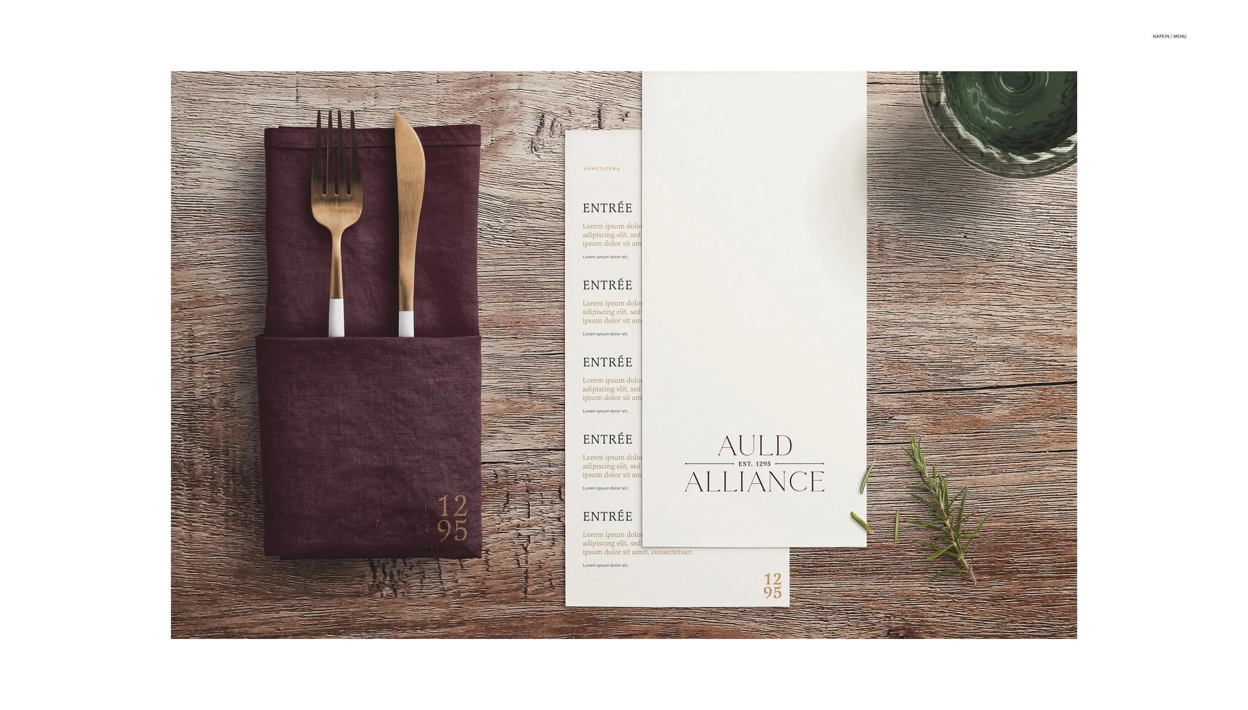
Application examples
This is usually where guidelines documents get weak. They stop at the system and skip the application. A strong guidelines document shows the brand on the real surfaces the business runs on. For hospitality, that is signage, menus, uniforms, guest room collateral, reservations email, booking confirmations, and social. For private clubs, that is bag tags, locker plates, scorecards, yardage books, apparel, and member communications. Show the real thing, at real scale.
Digital and web
A short but specific section on how the brand lives online. Approved web typography setup, button and form styles, link treatments, component patterns, social identity across Instagram, LinkedIn, YouTube, and email signature design. A link to the living design tokens if the brand is on a code-driven platform.
Accessibility
A standalone section on accessibility is no longer optional. Color contrast, minimum font sizes, alt text guidance, focus states, and reduced-motion behavior if the brand has animation. If the brand is subject to ADA signage requirements, document them.
Approvals and contacts
Who owns the brand. Who can approve what. Who to call when a question is not answered in the document. A short, real list of names. The guidelines are a living thing, and a living thing needs a person.
A glossary, if needed
For complex brands with sub-brands, product names, or industry-specific terminology, a short glossary goes a long way. It is the kind of section a new hire blesses you for on day one.
How long should it be?
Long enough to answer every real question. Short enough that a new team member reads the whole thing in a sitting. In practice, a tight guidelines document is often forty to eighty pages. Bigger is not better. A hundred-page document that nobody opens is worse than a thirty-page document people actually use.
Format
Deliver both a PDF and a web-based version where possible. The PDF is for printers, fabricators, and partners who need a signed-off reference. The web version is for the in-house team and freelancers who need to copy a hex, download an SVG, or check a tone example on a phone at 11pm before a launch.
If you are planning a brand project
Every ESQUE identity engagement ends with a guidelines document. See our brand identity page for scope and our journal post on how to brief a branding agency for how to start.