There are logos. And then there are marks. Images so rooted in a specific truth that they could not belong to anyone else.
The difference between the two is not craft, though craft matters. It is discovery. Great marks are not designed from the outside in, starting with aesthetics and working backward toward meaning. They are excavated. The designer's job is to go looking for what is already there, buried in the history of a place, the texture of a landscape, the intersection of two cultures, and bring it to the surface in a form that feels both inevitable and new.
The McLemore mark is a case study in exactly that process.
What the Land Already Knew
McLemore Resort sits 1,000 feet above a botanically diverse valley in northwest Georgia, in a region shaped by two distinct heritages: Cherokee and Scottish. This was not a marketing angle. It was a geological and cultural fact, written into the landscape itself. The Cherokee had lived in the mountain hollows for centuries. Scottish immigrants had settled the ridgelines and brought their traditions with them. Both cultures had left marks in the names of the creeks, in the patterns of the settlements, in the stories people still told.
When the time came to rebrand the resort's Highlands Course following a major redesign by legendary architect Rees Jones, the question was not what kind of logo would look good on a golf flag. The question was: what does this place actually say about itself?
The answer was already there. Two symbols, one from each culture, waiting to be held together.
The Problem With Easy Solutions
It would have been simple to choose one heritage and lean into it. A Celtic cross alone would read as classically Scottish, appropriate for a golf course, certainly. A Cherokee Dogwood alone would signal the botanical richness of the valley. Either would have been fine. Competent. Forgettable.
The insight was that neither alone told the whole truth. McLemore's story was not Scottish. It was not Cherokee. It was the place where those two things met, and had been meeting for centuries. The mark needed to hold that tension without resolving it into something easier to explain.
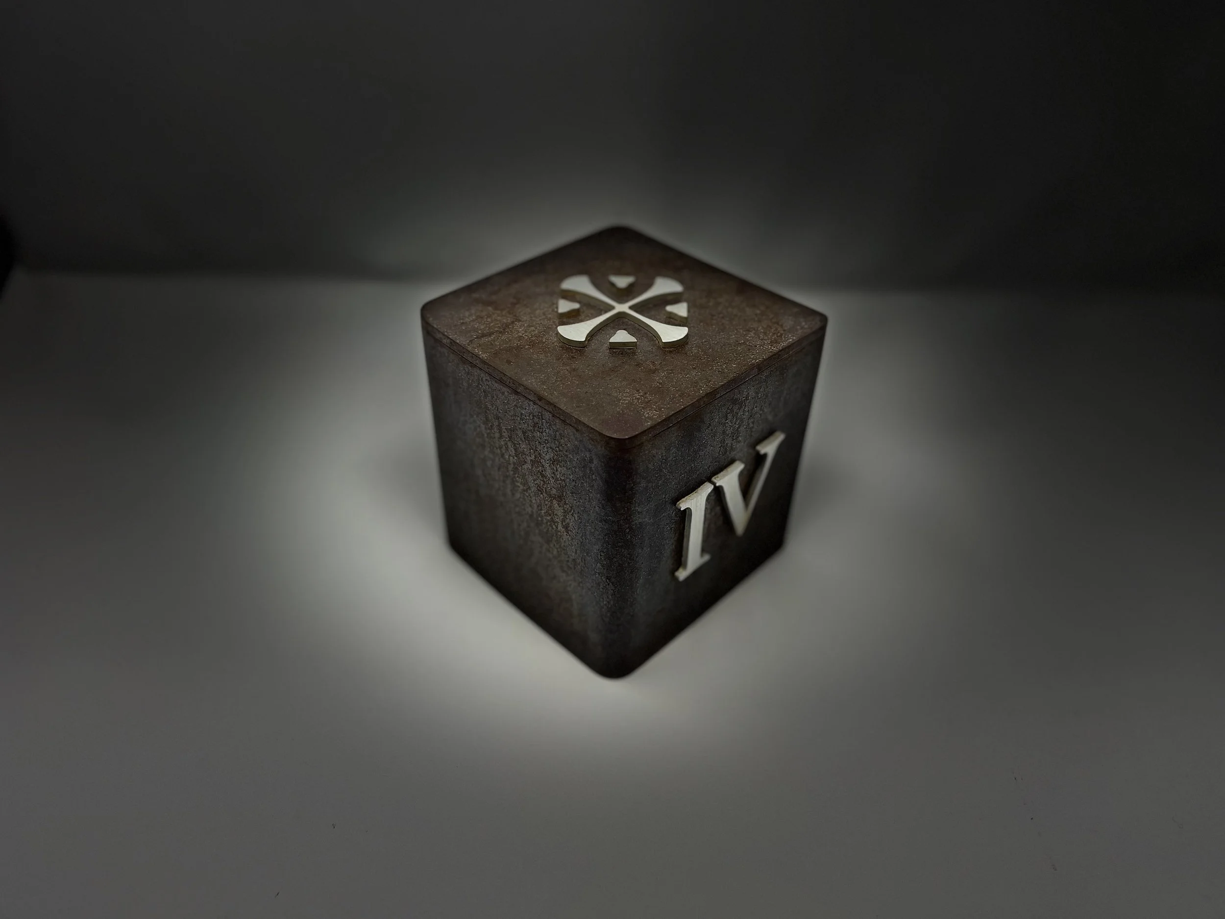
The Geometry of Two Histories
The solution is deceptively simple. The Celtic cross is overlaid within the Cherokee Dogwood. The cross appears in positive space, the dogwood in negative space. Neither element competes with the other. Neither disappears. They share the same geometry, occupying the same image without conflict, the way two cultures can share the same mountain.
Paired with Goudy Old Style, a typeface created in 1915, rooted in Italian Renaissance printing, carrying its own sense of long history, the complete mark communicates something no tagline could. It says: this place is old. It is specific. It is ours.
When a Mark Becomes a Language
What happened next is what separates a well-designed logo from a true brand mark. The McLemore mark did not stay on a letterhead. It spread, because it had enough meaning to carry, and enough flexibility to live in any material.
Today it appears on the monument sign at the resort entrance. On grand doorways. On tee markers cast in Corten steel and aluminum. On golf flags. On seasonal bag tags. On apparel. On custom hand-cast buttons for member sport coats. On the walls of the clubhouse gallery. In print advertisements placed in golf, home, and lifestyle publications across the country. Across every page of a 584-page website.
Each appearance is a new sentence in the same story. The mark does not lose meaning by repetition. It accumulates it. Guests who encounter it on a bag tag in the parking lot and again above the fireplace in the clubhouse and again on the flag at the 18th hole are not seeing a logo. They are inhabiting a world.
Rees Jones, the architect who commissioned the work, put it plainly: the messaging captured what makes McLemore special, the word spread, visitors came, and their expectations were consistently exceeded.
That is what a mark can do when it is discovered rather than invented.
ESQUE is a strategy, branding, and design studio. We work with clients whose ideas deserve to be experienced, not just seen. Get in touch.