Objective
Selah Spa sits on the same Lookout Mountain property as Cloudland Hotel. The brand had to feel quieter than the hotel it belongs to. Naming needed a word that carried weight without translation, something ancient that invited rest. The visual program had to avoid wellness clichés without tipping into cold minimalism. This is a luxury spa brand identity built for hospitality guests who know the difference between designed calm and honest calm.
Solution
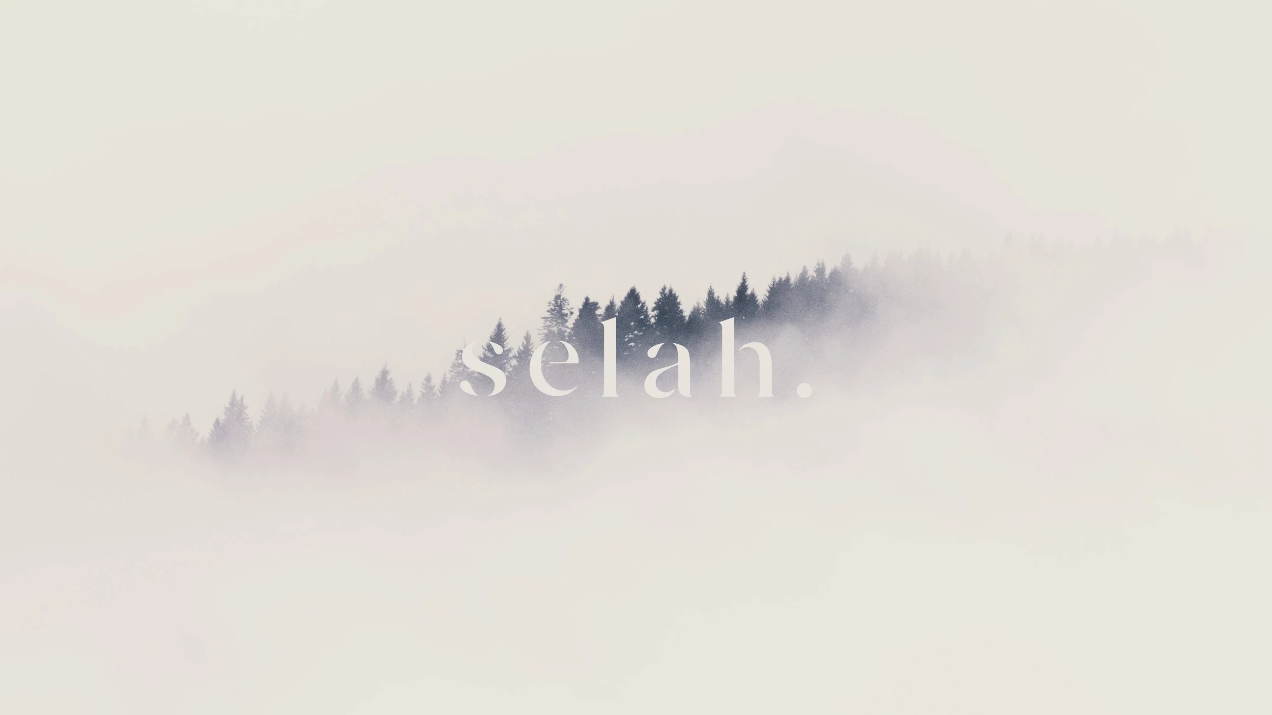
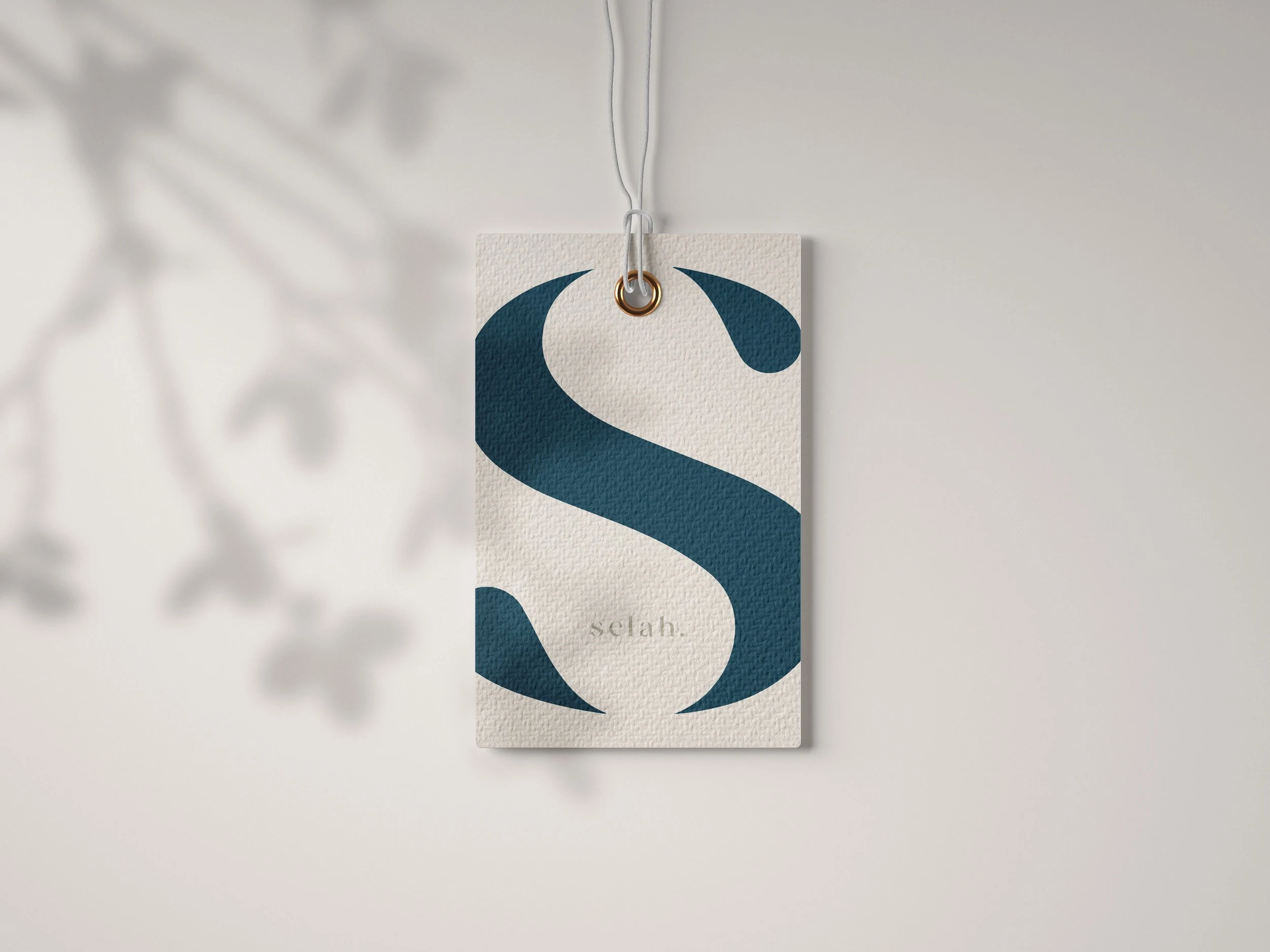
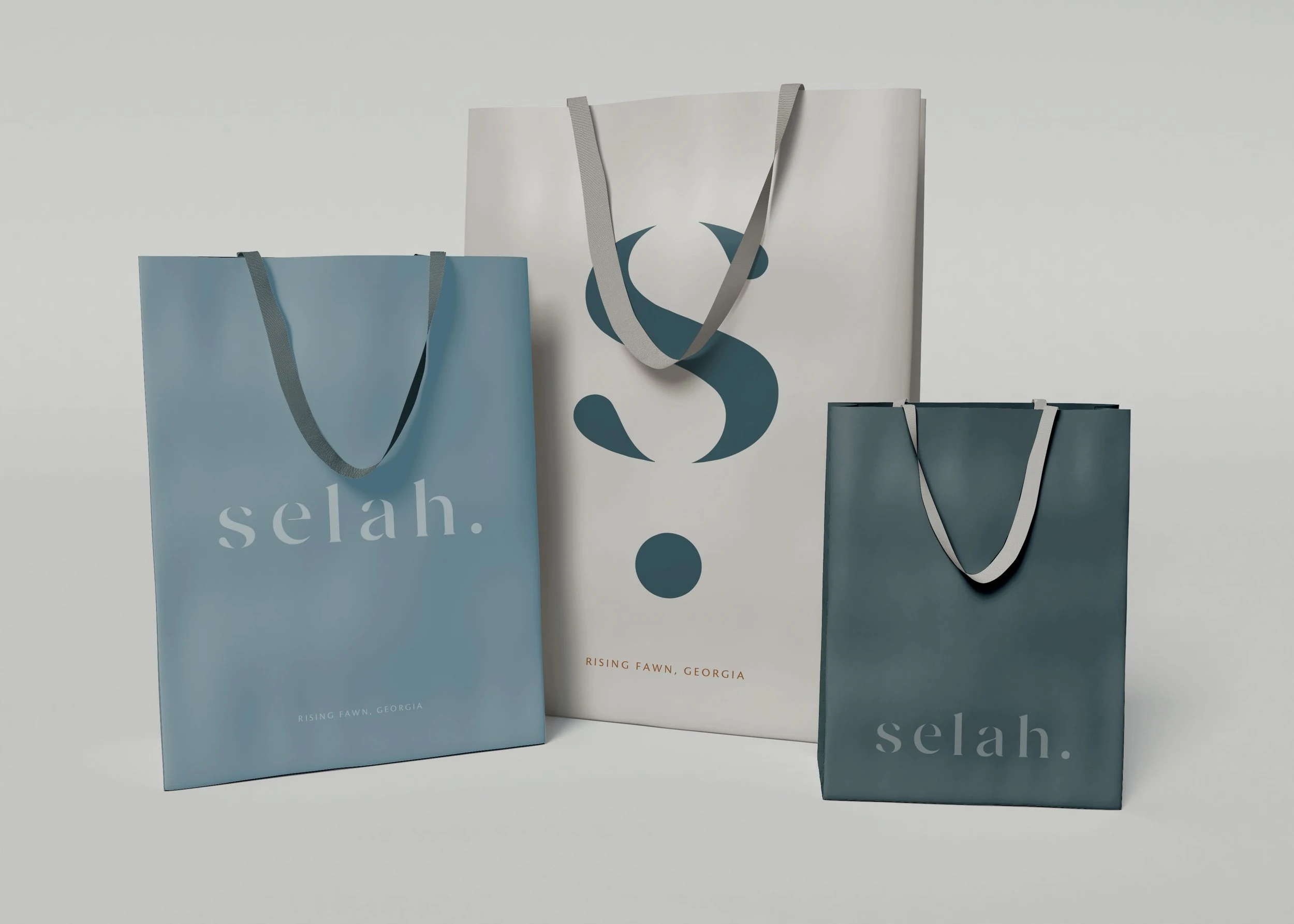
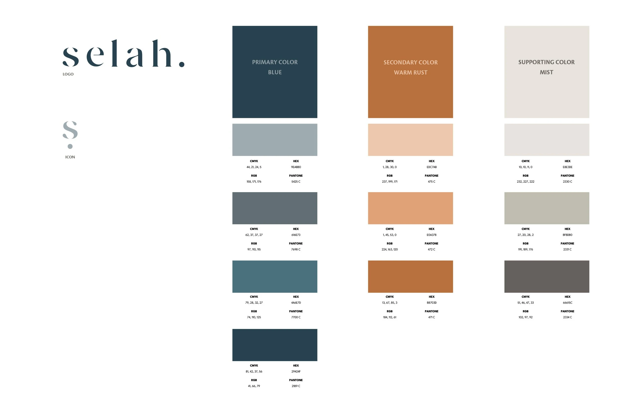
The name Selah comes from the Hebrew Psalms, where it functions as a musical instruction meaning pause, rest, lift up. Scholars still debate the exact meaning, which suits the brand. The identity system uses a minimal sans-serif with generous whitespace, a palette of cool grays, soft violets, indigos, and earth tones. No flourishes, no overworked marks. The restraint does the work.
Special Features
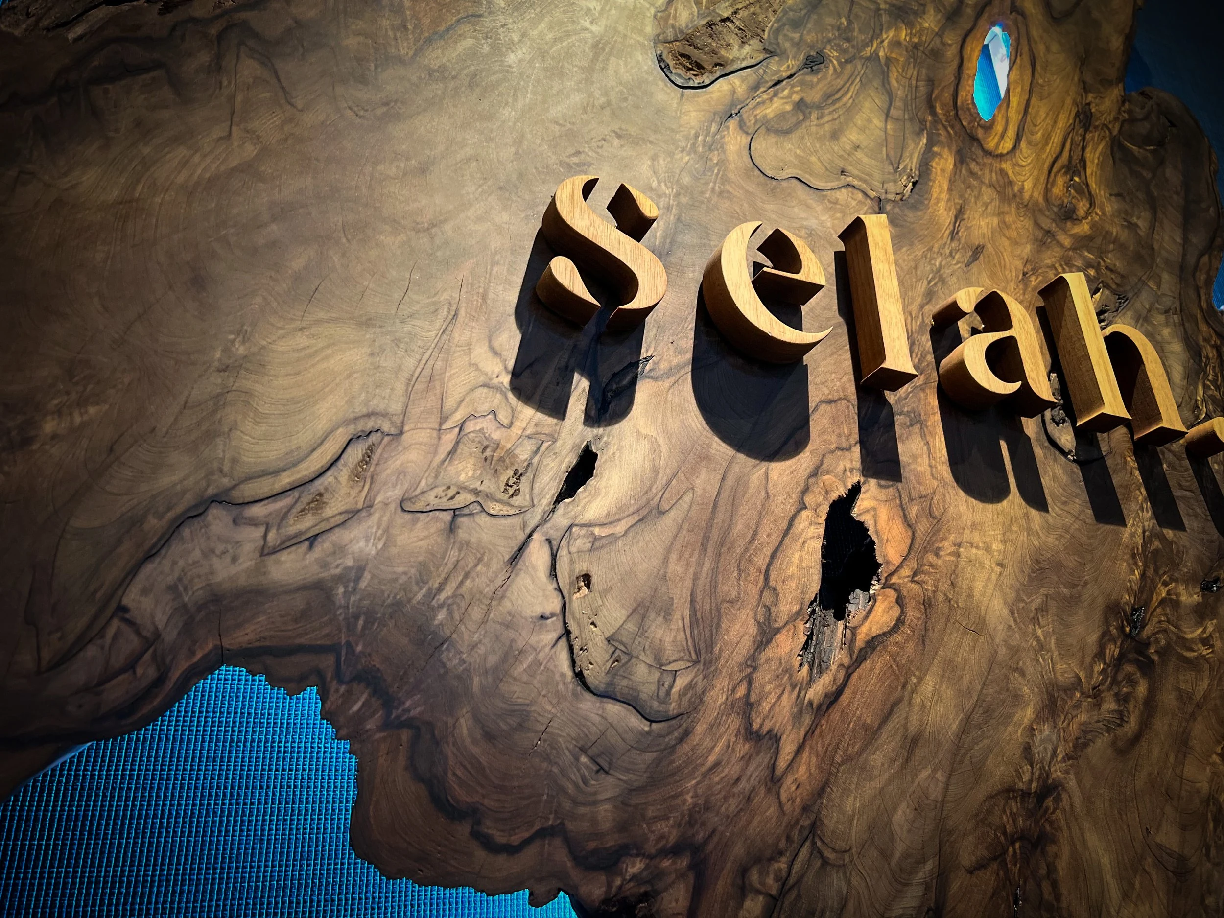
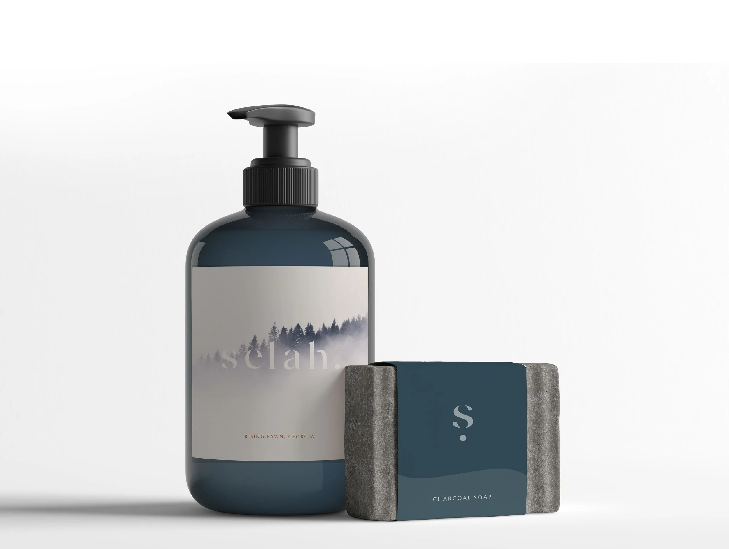
The entrance sign is cut from back-lit cypress carbon-dated to 182 B.C. The first thing a guest reads is also the oldest thing they touch. Product packaging for in-spa retail follows the same system. Signage, collateral, and guest-facing print carry the same quiet treatment. The spa brand identity reads consistently across a soap wrapper, a treatment menu, and the building itself.
Deliverables
Services
Collaborators