"Given how distinctive The Keep is within golf, IV Whitman skillfully named, branded, and described it in a way that clearly communicated the experience awaiting future visitors."
Rees Jones
Objective
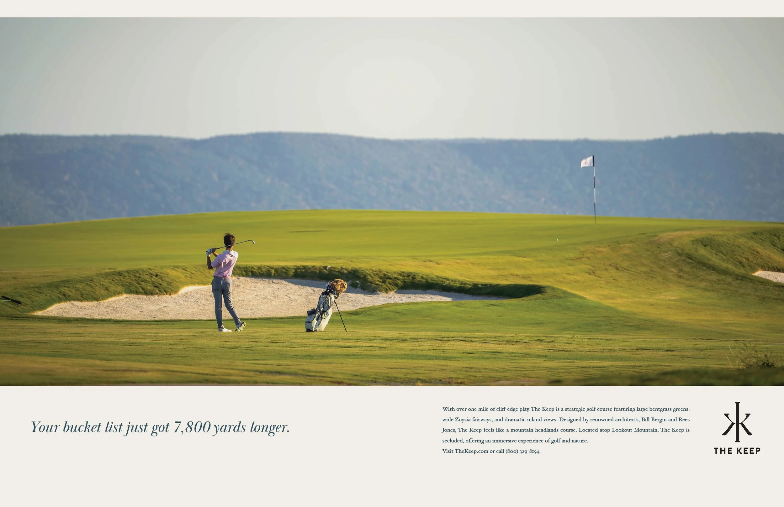
The Keep is a 125-member, 7,800-yard mountaintop golf course designed by Rees Jones and Bill Bergin. The brand identity had to match the permanence of the course. Medieval architecture offered the frame. A keep is the fortified tower at the heart of a castle, the last thing to fall. For an exclusive private golf club brand identity, that metaphor set the visual direction: something old, something defensible, something earned.
Solution
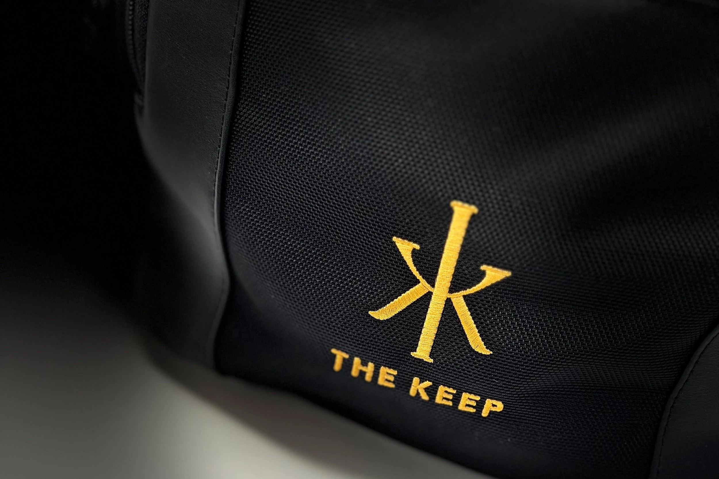
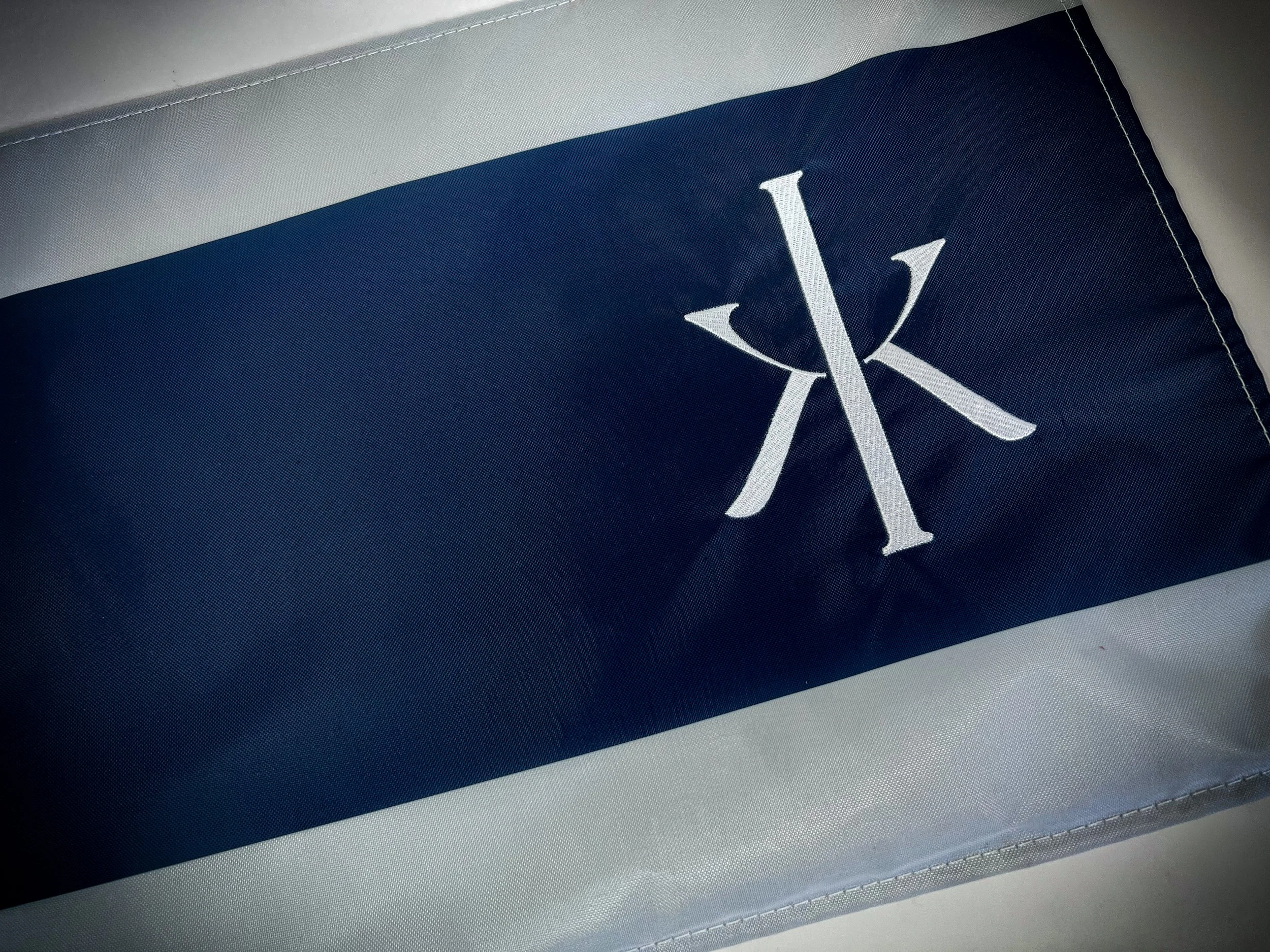
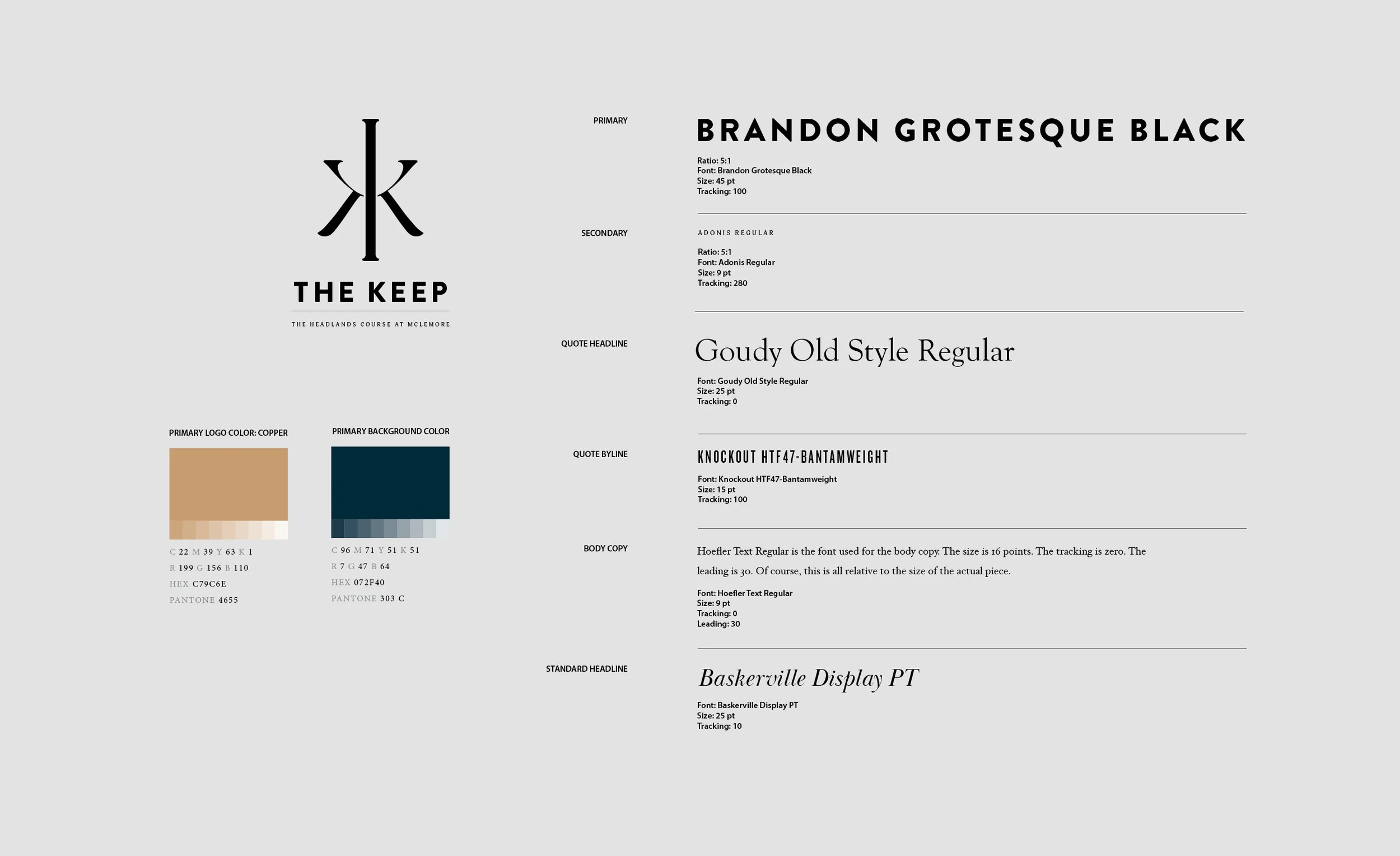
ESQUE modified the chi rho, the oldest Christian monogram, into the letter K by extending its vertical bar. The cross and the K share a single form. Typography follows with a two-weight display system for print and screen. The palette pulls from copper oxidation, mountain fescue, and weathered stone. Photography direction keeps the course unretouched. The system carries through website, apparel, print, and signage.
Special Features
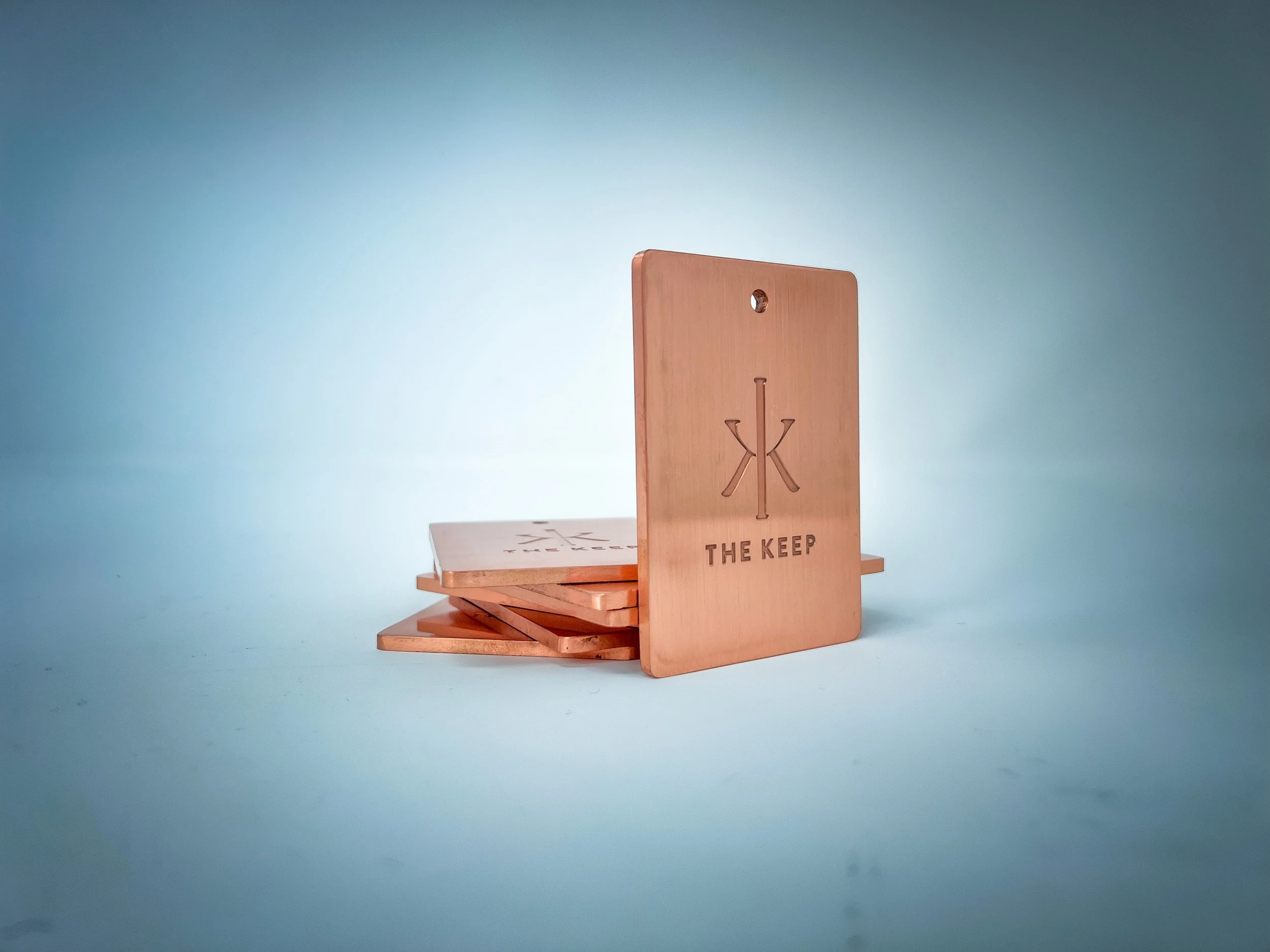
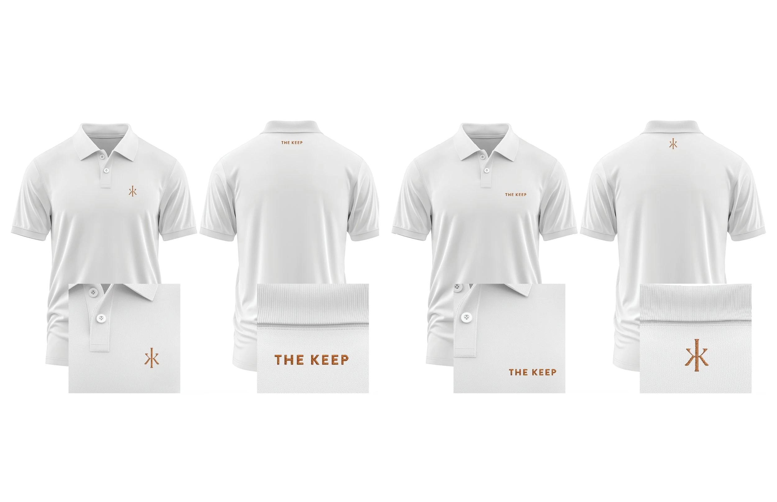
Copper bag tags develop patina as members use them through a season. Leather scorecards carry the mark embossed rather than printed. A members-only website reads like a private journal. Apparel and print hold the same restraint. Every application of the identity reinforces The Keep as a private club with staying power.
Industry
Deliverables
Collaborators